Monday, February 08, 2010

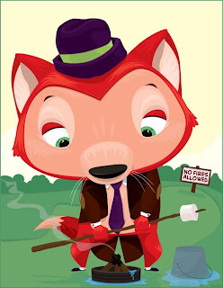
Fox with marshmallow

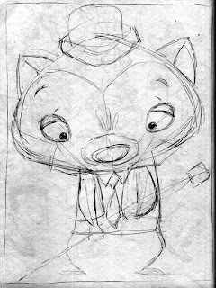
For this image I took the rough sketch from my sketchbook...

and placed it into an Adobe Illustrator file on it's own layer.
I set the scan to multiply.
Then I made a new layer underneath so that I could draw the fox and still see the rough art over the top of what I was drawing.
This is the result.

My original intention was to take this Illustrator image into Photoshop and add texture to it.
I played with it a little bit but didn't like the way it was going so I stopped.
The image looks a bit unbalanced to me. I think it could use something down at the bottom left to strengthen the pyramid composition.
I am considering adding his bag of marshmallows on the ground or maybe a small critter who is sharing his disappointment. I'm not sure yet.
Opinions are welcome.

Wednesday, February 03, 2010

5 eyed monster

Here's the latest inked piece of art.
This was originally drawn in my sketchbook for Illustration Friday.
My goal was to draw 3 monsters that read as one monster until you started to really look at the drawing.

I think this one would be better with some color.
The monsters are very white. I didn't want to get too heavy with the fur. I was concerned it would become hard to read.
I used a combination of tech pen and brush and ink on bristol board.

I have started sketching some ideas for new art....
My wife has said that I am making too many complicated/detailed drawings lately.
I should do some simpler art. "People ooh and aah over it."
I can see what she means, so I am sketching up some simpler ideas to work on.
Here are a few that I sketched out yesterday.

This one is to add more people to my samples.
The girl is outside giving a letter to the mail bird to deliver.

I think I'll do this one in Black & White and also in Color.

This one was inspired by one of Aesop's Fables, The Fox and the Grapes.

I believe this one will also be in Black & White and also Color.

This one is the simplest of the 3.
He's just a dressed up fox holding something.
He was inspired by the art in the Fable book.

I believe I will "ink" this one in Adobe Illustrator. And then do a color version using Illustrator also and then take it into Photoshop to play around with texturing it.

Monday, January 25, 2010

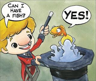
These art the last two inked images from the circus story.
I don't believe I'll ink the whole story. These were meant to show a single character drawn in several different images. Portfolio pieces for children's book publishers.
The first one is the boy swallowed up by a snake.

The second is a visit with the circus monkeys.

Both were drawn with a mix of pen, brush , and ink.


MeMonday1/25/10

This is todays self portrait.
I drew this one in my sketchbook using pencil and brush & ink.
Time: 20 - 30 min.


I realized the other day that drawing these on Monday morning, or any other morning, doesn't show me "at my best. But I like the results so far.
For todays drawing I decided in advance that it would be drawn with brush and ink.
I'm working on my control of the brush.


Friday, January 22, 2010

3 birds inked

I finished the inking on the 3 birds. This is the final art.

Let me know what you think.

Wednesday, January 20, 2010

New inks

These are a couple of pieces that I started yesterday.
This one is a circus train being pulled by a clown car.


I'm wondering if it needs a background. Nothing fancy. Just a pattern or something.
If you have an opinion, let me know what you think.

This second one is still a w.i.p.

It's also a piece that was done in color previously.
I am changing it for inking. 
As you can see by the hat on the top bird I am planning on adding texture and pattern to the piece. I stopped here to scan it so that I can save this stage so I can print it out on paper and do some experimenting before committing to the final image.
I need to decide how to treat the sky and grass and I'm not sure what I want to do yet.
Again if you have any comments, let them fly.

MeMonday1/20/10

Here's this Monday's self portrait.


What's that you say? It's Wednesday.
I do believe you're right.
I spent most of Monday working on my resume, trying to make new contacts on "LinkedIn"and job hunting on the web.
You wouldn't have wanted to see how I looked on Monday. I know I didn't want to look in a mirror that day.
Tuesday I was called in to be a sub for a High school math class.
So I took art with me to ink while I was there.
I'll post it after this.
Subbing for High School is nice because the kids are usually well behaved enough that I just have to be there to  hand out the work the teacher left for them to do or start the dvd player so they can watch a movie.  Then I can sit down and draw while scanning the room every couple of minutes to make sure no one is using there Iphone or whatever.

Most of the time they don't even realize that I am drawing. Teens are very self absorbed.
When they do I usually end up with a group of kid looking through my sketchbook.
I kind of nice to see what they like or think is funny.

Today is Wednesday and I finally sat down to draw the self portrait.
This was a quick one. About 20 min. on paper with ebony pencil.

Monday, January 11, 2010

#2 self portrait series

Here's the second self portrait for the year.
The plan is to do one every Monday Morning.

Pencil on paper. 16/20 min.
There's no measuring proportions or preplanning. It's just a quick observation.
Since It's winter here in the midwest and it's been snowing on and off for the past 4 or 5 days I am dressing in my winter gear.

Friday, January 08, 2010

Inking 102

Here's another revisited piece of art for my Black on white portfolio.
It's a piece featuring Vincent Van Gogh and Toulouse Lautrec.
The main reason for revisiting this piece is that the original painted version was damaged by a colored liquid of some sort.
The secondary reason is to continue my inking development.
So this was the original line art for the painted version...

It was never intended to be final art.

In order to do an inked drawing from it I reduced the size to fit on an 8.5 by 11 piece of bristol paper. Then I reduced the opacity of the art to 10%...

and printed it out on the bristol paper.

The result is that I had a basic outline to start with that wouldn't get in my way if I wanted to alter anything. And I did change a couple of things here and there.

The first pass at inking came out looking like this...

I like to scan the art in stages so I can see it on my screen and save the art. That way if I do something to it later that I don't like, I can print out the saved version and start again without completely starting over.
I looked it over and decided that I needed to do something about the lady on right. She was much to white, which made her the center of attention.
I also decided that the dog on the bottom left ,the flower pot, the two guys faces, and the background needed more work. 
This is the result...

I scanned it and looked it over.
I felt that the background , some of the painting of the lady, and Van Gogh's hat needed to get darker.
This is the result...

I also thickened the border to hold it all in.
Overall I'd say it's a successful drawing.
Here's a close up...

I'll do more like this for the portfolio.

Materials...

Cheap bristol paper.
Faber Castell Pitt artist pens - XS and S.

I liked the way the ink from the pen soaked into the paper quickly and didn't smear or bleed.
If I had to cover large areas in solid black it would be a problem like when I used it with the brush. I would most likely fill in the big areas in photoshop to get a solid black and save ink.

Wednesday, January 06, 2010

Going back to the circus

I previously stated that one of my goals for this year is to do more inked art.
My first project will be to re-illustrate, in black on white, the art I recently painted for an emergent reader.
Here's the original line art....

It was never intended to be "finished art."

Here's the newly inked image...

If you compare the two you'll notice that I changed some things.
To start with I made the boy's nose much smaller.
I also sent him to the dentist to have that gap in his teeth fixed.
The result is a more normal/appealing appearance. 
I decided to change the title to avoid any © infringement issues.

Materials:
I used Speedball Super Black India Ink and Windsor & Newton #1 and#4 brushes to ink on some cheap bristol paper.
The brushes aren't the best for inking. The #1 brush wouldn't keep a nice point. The #4 worked alright.
The paper sucked up the ink and made it hard to get solid black coverage.
I manipulated the art in Adobe Photoshop after the art was done to get a solid uniform black.
As far as inking with a brush goes I like it. I have a lot of practicing to do to be able to get a nice smooth stroke though.

I like the way this turned out so I will do the rest of the pages with these materials.
At the same time I will be experimenting with ink pens/markers and other papers.

If anyone has any recommendations of materials that have worked well for them please let me know what they are and I will look into trying them out.

Monday, January 04, 2010

2010

It's a new year!
It's fresh. It's clean. And ready to draw on.
So I've been considering what to do with 2010.
First off, I picked up this book...

I be reading it from cover to cover this month and then applying what I learn from it to my book art throughout the year.
I will review the book either as I go along chapter by chapter or as a whole. This is my first book review so I'll figure that out as I read it.

Secondly, I have decided to take a lesson from the "Old Masters" and do some self portraits.
The plan is to do one a week. Probably on Mondays.
This is the first one. Pencil drawing done in about 20 min.

They will be done however I feel like doing them that day. Pencil sketch, watercolor, whatever.
The plan is to help develop my observation skills.

Thirdly, I will be doing a lot of black and white inked art this year.
I have noticed lately, that when I go to the book store, I am attracted to the line art of the chapter books for boys/girls.  

Forthly, I will be searching for a "focus" for my children's art.
I will be playing with creating a small group of characters to star in my art.
I have a few ideas, but I will be experimenting in my sketchbook for the next couple of months to see what comes up.

I have also decided to focus on the "Old Masters" in my own way.
Particularly, Vincent Van Gogh. He has been a favorite of mine for many years and I find myself thinking of him a lot lately. I believe I will be writing a story featuring Vincent. I don't know if it will be fact or fiction or a mix of both.
I have this idea of doing some cartoony fact sheets. Each would focus on an "Old Master."

That's all I have figured out so far.
We'll see how it goes.....

Wednesday, December 30, 2009

Process Report - 

Yesterday I finished the revision to the last assignment of my illustration class.
The revision was self imposed. I didn't like the digital collage version that I made so I decided to redo the art.

Here's the process I went through.

The original rough...
As I remember them the comments during the critique were as follows...
She looks very uncomfortable, both in body position and by having her straddle that very big branch.
There's too much going on with the multiple nests, squirell, the mouse, and the bug.

I agreed with the comments so I searched the "net" for some images of kids sitting in trees, as well as, robins, and fall clothes.
Then I reworked the rough and came up with this...

The girls clothes stayed the same.
Her posture was improved and I changed the tree to have a curving horizontal trunk that I found on the "net."
I added another horizontal trunk so she would have a place to rest her foot.
I added another robin and positioned him so that the beaks of both birds pointed to her hand offering up the piece of sandwich. This helped improve the focal point of the image.
I removed one nest from the bottom of the image, the squirell, mouse, and bugs.
The mouse will be appearing in another illustration along with several more.

I took this rough and decided that I would do an inked version.
One of my areas to focus on this year is black and white line art.
I believe I need more for my portfolio. And I like doing it.
So, this is the first inked image. It's more of a coloring book,open feel.
The type would be printed in black in the upper left leaves.

It could be used as is, or flat color could be added using Illustrator for a screen printed feel.
I liked this one, but I wanted to do a "fully inked version."
So I inked it again...

This time I used "heavy blacks" to make sure the focus stayed on the girls hand.
I focussed on texture and giving the robins some "personality."
I really like this version. It will go onto my web site and to my agent.

I still had the urge to paint the image in color to get that "fall feeling" with the color.
So I went back to the rough and transfered it to a piece of watercolor board and made a tight pencil drawing. Then I did an under painting using watercolors.
It came out like this...

I removed the upper right nest.
I have to say that this is the first time I purposely started with an underpainting, and I was worried about how the final art was going to turn out. So I put it away for a few days because I wanted to start the next step of painting it with gouache when I was able to sit down and focus on it properly. The holidays were here and there was no time for an involved painting session.

Around the 27th my wife got tired of looking at me a day and told me I needed to get back to work. So I spent all day out in the studio and painted the final version.
I was still worried about how it was going to turn out, so I started with the robin on the left to build up some confidence.

He came out like this...  

I liked the way he turned out. So with my confidence restored I continued on with the rest of the painting.
It turned out like this...

I like it. It's not the usual bright "Yellow, Red, Orange" fall pallet. It's more of a muted version.
Now I can say I am done with this image. I don't feel the need to do any other versions of it.
I am considering using the multiple images in some sort of self promotional way.

There were a few revelations that came from doing several versions of this image.
The first was that I have always liked doing black and white art. 
So I will do more.
The second is that I like to do animals realistically with some personality. 
So I will do more.
The third is that my work improves when I search for reference materials and use them to influence the final art instead of making everything up from my imagination/memory all of the time. 
So I will do more.
The fourth is I like to paint. And I need to develop my color sense and modeling of the form. 
So I will do more.
Lastly I have talent that people want and I need to let them know it with self promotion. 
So I will do more.

So my recommendation to you for 2010 is "to do more."
Good luck in the new year!
Friday, November 20, 2009

Color revision time.

At this weeks Illustration class we showed our work for the emergent reader.
The comments on my work were mixed.
The main one that I need to focus on to improve my art is that the backgrounds are interfering with the ability to see the characters. 
It was recommended that I change the colors, remove some color and show "the white of the page", and or make the background colors flat/solid and not so washy.
With that in mind I have played around in Photoshop a bit to do some quick revisions...

This is the original painting...

This is with a solid lavender for the upper part and a solid brown for the bottom part without touching the middle red and white bit.

This one has a solid blue top part, solid red and white stripe, and a solid brown bottom part.
This one has a solid white upper part without touching anything else.
Let me know your opinion on the best way to proceed. 

These are the "finished" pieces I showed in class...


Thursday, November 05, 2009

Tighter Line art

These are the the line drawings that I print out onto watercolor paper.
I will reduce the opacity to about 10 or 15% so that I can see the lines to do the watercolor painting .
After the painting is done I will go over it with either pen or a combination of pen and colored pencil.
After the paintings are finished I will scan them and add the type using Adobe Illustrator.


I should say that I don't usually revise my art this many times.
Usually the process is roughs, tight pencils, transfer to the painting surface, and then paint.