Wednesday, December 30, 2009

Process Report - 

Yesterday I finished the revision to the last assignment of my illustration class.
The revision was self imposed. I didn't like the digital collage version that I made so I decided to redo the art.

Here's the process I went through.

The original rough...
As I remember them the comments during the critique were as follows...
She looks very uncomfortable, both in body position and by having her straddle that very big branch.
There's too much going on with the multiple nests, squirell, the mouse, and the bug.

I agreed with the comments so I searched the "net" for some images of kids sitting in trees, as well as, robins, and fall clothes.
Then I reworked the rough and came up with this...

The girls clothes stayed the same.
Her posture was improved and I changed the tree to have a curving horizontal trunk that I found on the "net."
I added another horizontal trunk so she would have a place to rest her foot.
I added another robin and positioned him so that the beaks of both birds pointed to her hand offering up the piece of sandwich. This helped improve the focal point of the image.
I removed one nest from the bottom of the image, the squirell, mouse, and bugs.
The mouse will be appearing in another illustration along with several more.

I took this rough and decided that I would do an inked version.
One of my areas to focus on this year is black and white line art.
I believe I need more for my portfolio. And I like doing it.
So, this is the first inked image. It's more of a coloring book,open feel.
The type would be printed in black in the upper left leaves.

It could be used as is, or flat color could be added using Illustrator for a screen printed feel.
I liked this one, but I wanted to do a "fully inked version."
So I inked it again...

This time I used "heavy blacks" to make sure the focus stayed on the girls hand.
I focussed on texture and giving the robins some "personality."
I really like this version. It will go onto my web site and to my agent.

I still had the urge to paint the image in color to get that "fall feeling" with the color.
So I went back to the rough and transfered it to a piece of watercolor board and made a tight pencil drawing. Then I did an under painting using watercolors.
It came out like this...

I removed the upper right nest.
I have to say that this is the first time I purposely started with an underpainting, and I was worried about how the final art was going to turn out. So I put it away for a few days because I wanted to start the next step of painting it with gouache when I was able to sit down and focus on it properly. The holidays were here and there was no time for an involved painting session.

Around the 27th my wife got tired of looking at me a day and told me I needed to get back to work. So I spent all day out in the studio and painted the final version.
I was still worried about how it was going to turn out, so I started with the robin on the left to build up some confidence.

He came out like this...  

I liked the way he turned out. So with my confidence restored I continued on with the rest of the painting.
It turned out like this...

I like it. It's not the usual bright "Yellow, Red, Orange" fall pallet. It's more of a muted version.
Now I can say I am done with this image. I don't feel the need to do any other versions of it.
I am considering using the multiple images in some sort of self promotional way.

There were a few revelations that came from doing several versions of this image.
The first was that I have always liked doing black and white art. 
So I will do more.
The second is that I like to do animals realistically with some personality. 
So I will do more.
The third is that my work improves when I search for reference materials and use them to influence the final art instead of making everything up from my imagination/memory all of the time. 
So I will do more.
The fourth is I like to paint. And I need to develop my color sense and modeling of the form. 
So I will do more.
Lastly I have talent that people want and I need to let them know it with self promotion. 
So I will do more.

So my recommendation to you for 2010 is "to do more."
Good luck in the new year!
Friday, November 20, 2009

Color revision time.

At this weeks Illustration class we showed our work for the emergent reader.
The comments on my work were mixed.
The main one that I need to focus on to improve my art is that the backgrounds are interfering with the ability to see the characters. 
It was recommended that I change the colors, remove some color and show "the white of the page", and or make the background colors flat/solid and not so washy.
With that in mind I have played around in Photoshop a bit to do some quick revisions...

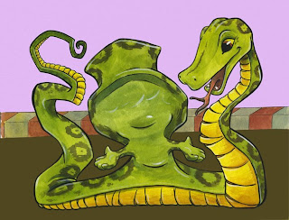
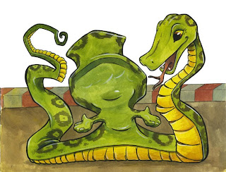
This is the original painting...

This is with a solid lavender for the upper part and a solid brown for the bottom part without touching the middle red and white bit.

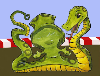
This one has a solid blue top part, solid red and white stripe, and a solid brown bottom part.
This one has a solid white upper part without touching anything else.
Let me know your opinion on the best way to proceed. 

These are the "finished" pieces I showed in class...


Thursday, November 05, 2009

Tighter Line art

These are the the line drawings that I print out onto watercolor paper.
I will reduce the opacity to about 10 or 15% so that I can see the lines to do the watercolor painting .
After the painting is done I will go over it with either pen or a combination of pen and colored pencil.
After the paintings are finished I will scan them and add the type using Adobe Illustrator.


I should say that I don't usually revise my art this many times.
Usually the process is roughs, tight pencils, transfer to the painting surface, and then paint.

Tuesday, November 03, 2009

Tight line art

Here are the tightened up pencil drawings for "Can I Have Pet?"
I finished them up last night.


Now I just have to redraw them again to get the final line quality that I want.
I haven't decided if I'll be using pen or pencil for the final line art yet.
I beleive I'll go with pencil and scan that into my computer so that I can print it out onto watercolor paper for painting.

Monday, November 02, 2009

Illustration class roughs

For this class we were to have our roughs for the emergent reader manuscript ready to go over.
These are the roughs I had to show. I decided on a circus theme, so I made the boy look like a ring master.
Can I have a pet?

Can I have a pet?

Can I have a monkey?

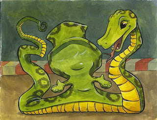
Can I have a snake?

Can I have a zebra?

Can I have a bear?

Can I have a lion?

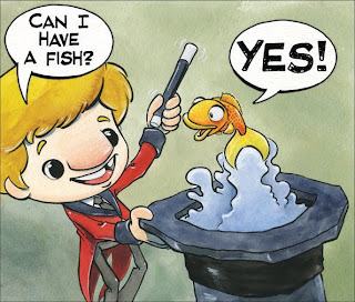
Can I have a fish? Yes!


I'm working on revising/tightening the roughs now so that I can do the tight line art and experiment with how the final art will be done.
I'm thinking of doing a simple inked line drawing and watercolor with some colored pencil for color.

Friday, October 30, 2009

October Mailer

I just created and sent out this newsletter to my list of contacts.
If you see it or know of anyone who might like to see it, please feel free to send them a link to this site, or copy the file to your desktop and send it to them.
I would greatly appreciate it.

Monday, October 26, 2009

Cinderellastien art finished!

Over the weekend I was able to finish inking the 3 samples from the Cinderellastein story.
Here they are...
The Evil Step Mummy and the Evil Step Monsters let Cinderellastein know who's boss by presenting her with the list of chores she has to do.


The Evil Step Mummy makes sure Cinderellastein knows she won't be going to the Monster Mash.


The Fairey God Monster transforms Cinderellastien's clothes and mop so she can go to the Monster Mash. It's not a pleasant experience.


I drew the final art on Graphics 360 100% rag Translucent Marker Paper using Prismacolor Premier markers. Sizes 01, 03, and the brush tip.

The art was then scanned into Photshop and the Brightness/Contrast was adjusted to make the blacks solid.

Tuesday, September 15, 2009

Girly Bird!

Let me introduce you to Girly Bird. She's a cute little bird with a little girls soul.


She was born from the sketches for my Color board book of birds.
She's a fun, frilly, feathered friend who will stick by you until the very end.
As you can see this is the cover art for her first book. "Let's Pretend"
Now all I have to do is write the story.

Tuesday, September 01, 2009

IF - Magnify

Just a quick little sketch to play with the word magnify and change it to Magni-fly.
This is what it looks like when you sneak up on a fly in the bathroom.


Pencil in my sketchbook. Actual size 2 by 3 inches.

Monday, August 24, 2009

Bird Book roughs

So far in my career as an Illustrator I've always had clients tell me what they needed from me as far as the art goes.
I'll continue to do that. I like to do that.
Lately I have been experiencing some "creative dissatisfaction" with the career.
I used to like to write a bit but never thought I was good at it. I'm not the type to let that stop me,
so I've decided to take some initiative and start creating projects for my illustrations.
I know my current limitations so the first one won't be the next Harry Potter. It will be a basic board book.

It's a color book featuring birds.
Each bird would have a 2 page spread.
The idea is to take the red bird and paint it in a monochromatic red scheme.
The green bird in a monochromatic green scheme, and so on, and so on.
So here's what I have for the first go round of roughs.

Red bird.


He'll be skipping down the sidewalk next to the street, probably with a picket fence in the far background.

Orange bird.


He'll be floating in the water. Maybe a fish will be jumping out of the water to make that upper right space more interesting.

Yellow bird.

alt=""id="BLOGGER_PHOTO_ID_5373736644698331522" />
He'll be playing with a couple of yo-yos that will replace the O's in the word Yo-Yo. I don't know what his background will be yet.

Green bird.


This one's self explanatory.

Blue bird.

Option A


He's sitting on a stump in the Bayou singing his heart out.

Option B


Same thing, different bird.

Purple bird.

Option A


He's jamming on the piano. Think Jerry Lee Lewis.

Option B


He's painting a portrait, I know he's painting grapes right now, like Picasso.

Brown bird.


This one will be a bakers kitchen scene.

Black bird.


He's catching the baseball out onn the field.

White bird.


I know this one is repetition. I need to think of something else for him to do that starts with a W.

The final art will be painted in a combination of watercolor, gouache, and possibly colored pencil.


That's what I have so far.
Your feed back/comments are welcome.

A few questions...

1. Are the birds interesting enough.
2. Are the pages too crowded. Laid out well?
3. Is one character enough per page?