Thursday, February 18, 2010

Val girl revisions - 2/18/2010


I have revised the line art for this image again after receiving some comments from the Picture Book Doodlers blog...


and from the scbwi web site.


You'll notice that I added letters to the two cats mouths and a wrapped dog bone at the feet of the dog.
I decided to keep the Bull Terrier. I like him because of the shape he makes.
I added the texture to the image, a gate - I kept it closed so that I didn't have to introduce any perspective into the image, and some additional greenery to create a bit of foreground.
The line art makes everything look like it's on the same plane right now.
I will be making sure that the background elements fall back in the painting process.
My next step will be to paint a wash of pink over the entire image.
I will probably use watercolor to do it.
I say probably because I saw a technique in a book today where the artist rubbed an even wash of color over her image using pastel and then went back in and removed the pastel in areas that needed to be lighter, then she sealed it with fixative and painted over the image with watercolor and acrylic to achieve the final art.
I might try the pastel.
I will be achieving the final art by painting with watercolor and gouache.

2/20/2010
Yesterday I worked on the under painting.
I decided to use watercolor for the underpainting because I already had the materials.
I would have had to go out to buy the right color(s) of pastel if I went with it.
As you can see I have an overall pink wash.
Then I went back in and added yellow to the sky, fencepost caps, and her scarf.


The next step will be to spray it with fixative and then start painting with more watercolor and then gouache for opaque detail.
I usually go back in at the end and do some color outlining.

Wednesday, February 10, 2010

Girl art

This is the second pass on the girl art I'm working on.

Here's the first rough for comparison.
You'll notice that I changed it quite a bit.
For the girl I ditched her head band and added a knit hat and scarf that I found on the web. I think it makes her look cuter and more dressed up. It gives her a better head shape as well.
My intention is to make this a February/Valentines image.
The girl is holding a "love" letter that the Postal bird will be delivering for her.
Since I made the letter bigger in the second rough I also decided to make the bird bigger.
Instead of the little chickadee type of bird I'm going with a Blue Bird. He's already dressed in the right color for the job of Postman anyway.
I'll be repositioning the bird so he sits properly on her finger.
I searched the web for dog and cat pics so that I could make the animals more realistic. One of my goals for this year. Less cartoony.
 I will be shrinking the cat so that she's smaller than the dog. The dog may get a little bigger.
I'll experiment with moving the cat more to the right to strengthen the pyramid composition.
If you see anything else to comment on let me know.

Monday, February 08, 2010

Fox with marshmallow

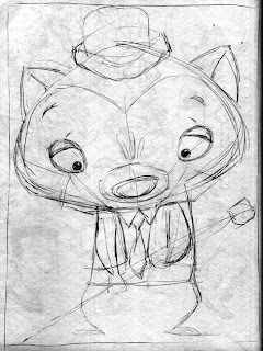
For this image I took the rough sketch from my sketchbook...

and placed it into an Adobe Illustrator file on it's own layer.
I set the scan to multiply.
Then I made a new layer underneath so that I could draw the fox and still see the rough art over the top of what I was drawing.
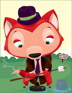
This is the result.

My original intention was to take this Illustrator image into Photoshop and add texture to it.
I played with it a little bit but didn't like the way it was going so I stopped.
The image looks a bit unbalanced to me. I think it could use something down at the bottom left to strengthen the pyramid composition.
I am considering adding his bag of marshmallows on the ground or maybe a small critter who is sharing his disappointment. I'm not sure yet.
Opinions are welcome.

Wednesday, February 03, 2010

5 eyed monster

Here's the latest inked piece of art.
This was originally drawn in my sketchbook for Illustration Friday.
My goal was to draw 3 monsters that read as one monster until you started to really look at the drawing.

I think this one would be better with some color.
The monsters are very white. I didn't want to get too heavy with the fur. I was concerned it would become hard to read.
I used a combination of tech pen and brush and ink on bristol board.

I have started sketching some ideas for new art....
My wife has said that I am making too many complicated/detailed drawings lately.
I should do some simpler art. "People ooh and aah over it."
I can see what she means, so I am sketching up some simpler ideas to work on.
Here are a few that I sketched out yesterday.

This one is to add more people to my samples.
The girl is outside giving a letter to the mail bird to deliver.

I think I'll do this one in Black & White and also in Color.

This one was inspired by one of Aesop's Fables, The Fox and the Grapes.

I believe this one will also be in Black & White and also Color.

This one is the simplest of the 3.
He's just a dressed up fox holding something.
He was inspired by the art in the Fable book.

I believe I will "ink" this one in Adobe Illustrator. And then do a color version using Illustrator also and then take it into Photoshop to play around with texturing it.